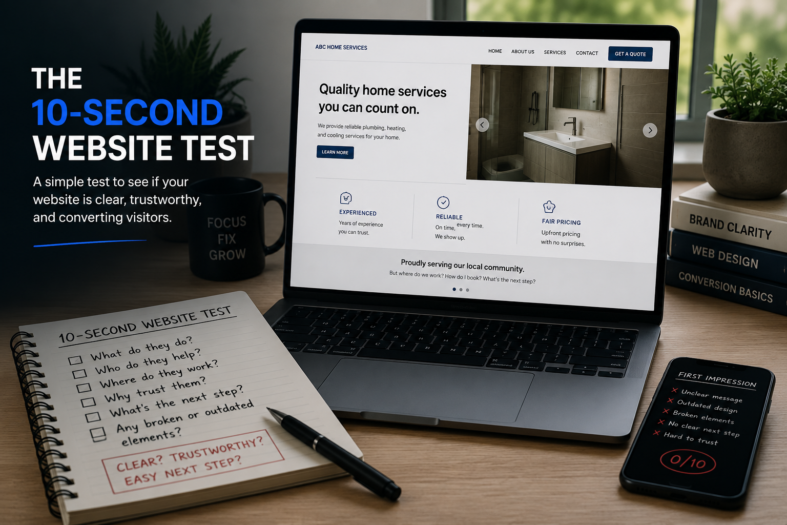
The 10-Second Website Test Every Business Owner Should Try
A lot of business owners judge their website by asking whether it looks good.
That is not the first question I would ask.
The first question is:
Can someone understand what the business does, trust it, and figure out what to do next within about 10 seconds?
If the answer is no, the website is probably making the customer work too hard.
And honestly, the first problem is often visible before anyone reads a single sentence.
Broken visual elements.
Sections that do not line up.
Buttons that look different from one another.
Images that are stretched, blurry, or badly cropped.
A page that feels outdated.
Random design choices that make the website look half-finished.
That first impression matters because people use it to decide whether the rest of the business feels trustworthy.
The short answer
A strong business website should make four things clear almost immediately:
What the business does
Who it helps
Why someone should trust it
What the visitor should do next
The website does not need to explain everything in 10 seconds.
But the visitor should understand enough to know they are in the right place and feel confident continuing.
Why the first 10 seconds matter
A visitor does not arrive at your website with unlimited patience.
They may have clicked from Google, social media, an advertisement, a referral, or an email.
They are usually trying to answer a very basic question:
Is this business relevant to me?
Before they read the service details, compare packages, or submit a form, they are looking for quick signals.
Does the business look legitimate?
Does the page feel current?
Can I understand what they do?
Is the next step obvious?
If the website creates confusion immediately, many people will leave without giving the business a fair chance.
The owner may interpret that as a traffic problem.
But the real issue may be that the website is losing people as soon as they arrive.
What I notice first when reviewing a website
The first thing I usually notice is not the copy.
It is whether the page feels broken.
A website can technically load and still feel broken.
For example:
Text does not align correctly
Images are stretched or cropped badly
Some sections feel polished while others feel unfinished
Fonts change without a reason
Buttons have inconsistent sizes or colors
Spacing feels random
Mobile sections overlap or run off the screen
Old graphics conflict with newer sections
Links or buttons do not work
The page looks like several templates were combined without a clear system
These details may sound cosmetic.
They are not.
They affect trust.
A visitor may not consciously say, “The spacing on this page is inconsistent.”
They are more likely to think:
This business does not feel professional.
That is why visual clarity comes before clever design.
Test 1: Can I tell what the business does?
Open the homepage and look at the first screen.
Do not scroll yet.
Can you explain what the business does in one sentence?
The headline should make the answer clear.
Weak homepage copy often sounds like this:
Helping you reach your full potential
Solutions designed for your success
Creating better outcomes
Your trusted partner
Taking your business to the next level
Those statements may sound polished, but they do not explain the offer.
A clearer headline sounds more like:
Residential plumbing and emergency repairs in Charlotte
Tax preparation for small-business owners
Personal training for busy professionals
Business and marketing strategy for service businesses
Wedding photography in South Florida
The homepage does not need to include every service in the headline.
It does need to give the visitor a clear category.
What to check
Ask someone unfamiliar with the business to open the website.
After 10 seconds, ask:
What do you think this company does?
If they cannot answer clearly, the website is probably relying on the owner’s existing knowledge instead of the visitor’s perspective.
Test 2: Does the website look current and intentional?
A website does not need to follow every design trend.
It does need to feel maintained.
An outdated website can create doubt even when the business itself is excellent.
Common warning signs include:
Tiny text
Cluttered navigation
Old stock photography
Excessive animation
Low-resolution images
Too many fonts
Heavy shadows and dated effects
Large blocks of centered text
Poor mobile spacing
Different design styles on every page
Obvious template sections that were never finished
The goal is not to make the website look expensive.
The goal is to make it feel clear, intentional, and trustworthy.
Simple usually works better than busy.
Test 3: Are there broken or careless visual elements?
This is the part I would check before rewriting the entire site.
Broken visual details can damage trust quickly.
Review the website on both desktop and mobile.
Look for:
Text overlapping images
Buttons that wrap awkwardly
Images cut off in important places
Blank sections
Icons that do not load
Uneven card heights
Headings split into awkward lines
Elements too close to the edge of the screen
Random horizontal scrolling
Misaligned forms
Mobile menus that cover content
Footer links that are difficult to tap
A business owner may stop noticing these problems because they have looked at the website too many times.
A new visitor sees them immediately.
Test 4: Is it clear who the business is for?
A visitor should not have to guess whether the service fits them.
The website should make the audience obvious through the headline, supporting copy, examples, service descriptions, and proof.
For example:
Local homeowners
Established service businesses
First-time homebuyers
Busy professionals
Medical practices
Coaches with an existing offer
Parents looking for tutoring
Companies with internal marketing teams
Trying to speak to everyone usually makes the message weaker.
Specific language helps the right person recognize themselves.
Test 5: Is the next step obvious?
Once someone understands the business, what should they do?
Call?
Book a consultation?
Request a quote?
Complete a form?
Visit a service page?
Take a diagnostic?
The website should not make the visitor search for the next step.
A strong call to action should be:
Easy to see
Easy to understand
Relevant to the page
Repeated when necessary
Simple to complete
Common problems include:
No visible button in the first section
Several competing buttons
Vague labels such as “Learn More”
Contact forms buried at the bottom
Buttons that lead to the wrong page
Different calls to action on every section
A contact page asking for too much information
The next step should feel natural, not confusing.
Test 6: Does the website give me a reason to trust the business?
A clean website helps, but design alone is not proof.
Visitors also want evidence.
That may include:
Customer reviews
Testimonials
Case studies
Before-and-after examples
Photos of completed work
Business credentials
Years of experience
Clear process explanations
Real team or founder photos
Service guarantees
Recognizable clients or partners
Specific results when they are accurate and supportable
The proof should appear close to the decision it supports.
Do not hide all the trust signals on a separate page that most people will never visit.
Test 7: Does the mobile version still work?
A website may look fine on a large desktop and fall apart on a phone.
That matters because many visitors will first see the site on mobile.
Check:
Is the text readable?
Are the buttons large enough to tap?
Does the page load quickly?
Are images cropped correctly?
Does the navigation work?
Are forms easy to complete?
Does anything overlap?
Is the main call to action visible?
Does the page require side-to-side scrolling?
Are important sections pushed too far down?
Do not assume Squarespace, WordPress, or another platform automatically makes every custom layout work well on mobile.
Responsive does not always mean usable.
Test 8: Is the page trying to say too much?
Some websites feel unclear because the owner tried to include everything at once.
The homepage becomes a combination of:
Company history
Every service
Every feature
Every testimonial
Every award
Every process detail
Every possible call to action
More information does not always create more clarity.
A homepage should guide the visitor through the decision.
A simple flow may be:
What the business does
Who it helps
The problem it solves
Why it is different
Proof
How the process works
The next step
The details can live on supporting pages.
Test 9: Are the service descriptions easy to understand?
Business owners often describe services using internal language.
The customer may not understand it.
Avoid relying on unexplained terms, acronyms, or package names.
Instead of only listing a service name, explain:
What it is
Who it is for
What problem it addresses
What is included
What happens next
The visitor should not need to schedule a call just to understand the basic offer.
The call should help them decide whether to move forward, not explain what the business does from the beginning.
Test 10: Does the website feel like the real business?
The website should match the actual quality and personality of the company.
A professional business with an outdated, broken, or careless website creates a credibility gap.
A friendly local service business with stiff corporate copy creates another kind of gap.
The website should feel consistent with:
The customer experience
The price point
The team
The service quality
The brand personality
The way the business communicates
The goal is not to pretend the company is something it is not.
The goal is to represent the real business clearly and professionally.
The complete 10-second website test
Not sure whether your website is the main problem?
The free Business Breakdown helps you review your website, marketing, offer, follow-up process, customer journey, and business systems so you can see what may need attention first.
Complete the free Business Breakdown:
https://www.jeremyaranamedia.com/business-breakdown
Open your homepage in a private browser window.
Use both desktop and mobile.
Then answer these questions:
Clarity
Can I tell what the business does?
Can I tell who it helps?
Can I tell whether the business serves my location?
Can I understand the main offer?
Visual trust
Does the website feel current?
Are any elements broken or misaligned?
Are the images sharp and relevant?
Does the layout feel intentional?
Is the design consistent?
Next step
Is the main action obvious?
Does the button explain what happens next?
Is the form or booking process easy?
Are there too many competing calls to action?
Proof
Can I see evidence that the business is credible?
Are reviews or testimonials visible?
Does the site show real work, experience, or process?
Does the proof support the offer?
Mobile
Can I read everything comfortably?
Are buttons easy to tap?
Does anything overlap or run off-screen?
Does the mobile version feel designed rather than compressed?
Any “no” answer gives you a place to investigate.
What to fix first
Do not redesign the entire website just because it feels imperfect.
Start with the issue most likely to affect trust or action.
A practical order is:
Fix broken elements
Clarify what the business does
Make the main call to action obvious
Improve mobile usability
Add proof
Simplify cluttered sections
Update outdated visuals
Improve supporting copy
This order matters.
A new font will not fix an unclear offer.
Better photos will not repair a broken contact form.
More traffic will not help if visitors cannot understand what the company does.
Fix the biggest point of confusion first.
When a full redesign actually makes sense
Sometimes small changes are enough.
Other times, the website has accumulated too many structural problems.
A full redesign may make sense when:
The platform is difficult to manage
The mobile experience is consistently broken
The business model has changed
The current design no longer reflects the company
The navigation is confusing
The site has several unfinished or inconsistent pages
Important conversion tracking is missing
Fixing the existing structure would take longer than rebuilding it properly
The decision should be based on the business problem, not boredom with the current design.
Final takeaway
A website does not need to impress everyone.
It needs to help the right visitor understand the business, trust it, and take the next step.
Start with the first 10 seconds.
Can someone tell what you do?
Does the website feel current and intentional?
Are there broken or careless visual elements?
Is the next step obvious?
If any of those answers are unclear, that is where I would start.
Fix the right problem first.
Your website may be one part of the problem—not the entire problem.
Use the free Business Breakdown to check the rest of the customer path and identify what to investigate first.
Get your Business Breakdown